
Match Or Mismatch? The Art Of Colour Contrast

When you’re choosing new artwork for a room, whether it’s a bedroom, a living room or hallway, it’s important to consider the concept of colour contrast.
It involves mastering the contrast of hue, the contrast of light and dark, the contrast of cold and warm and complementary contrast.
Understanding colour theory is all very well and good, but often it’s tricky to visualise exactly what an art print might look like.
And how do we know when to complement colours and when to contrast? How do we know what will look good?
Here, we touch on a few basics of colour contrast and provide visual examples to show how different the same room can look when we match and when we clash.
Matching and clashing are both beautiful – just different. Let’s celebrate that difference!
Aqua
In this interior, the colour aqua features strongly in the walls and the chairs. Coupled with a pea green sofa and teal cushions, the look is cool and calm with a retro vibe.
To match, choose artwork that features colours in the same palette. It doesn’t have to match exactly. It’s okay if the hue and the lightness is different – it will still appear complementary.
To clash, choose a piece of art that features a dominant colour which is radically different from the rest of the decor. Notice how the beige and teal behind the red still complements the colour of the sofa, cushions and chairs? This is key to create an overall cohesive look.
Match

Clash

Lilac
When it comes to matching pastels, particularly pinks, whites and mauves, floral prints are the go to solution. When clashing, it’s okay to go completely wild with an unexpected style of art. Why not try a vibrant abstract or dynamic contemporary print to add depth to the soft and feminine backdrop?
Note the complementary dapples of pink and violet in the abstract? It’s a trick of the trade – a way to ensure the clash is powerful but still visually appealing.
Match

Clash

Moss
What can you possibly match with a moss wall and a mustard sofa? Vintage is your friend here. How glorious are these sunflowers depicted in a style that oozes the appeal of simpler times. Very easy on the eye.
In contrast, bring the room alive with artwork featuring a completely different colour like purple. You still get the same vintage appeal, but this time it’s bursting with colour and life.
While there is no moss colour included in the print, see how the butterflies match the chair? Interior design is an art form in itself.
Match

Clash

Mustard
Mustard and khaki green (more recently known as ‘olive drab’) is a match made in heaven. Go for gold with landscape photography featuring autumnal trees, golden meadows or vibrant sunsets.
If contemporary art is more your thing, enjoy colour contrast with a multicoloured print. The colours are different, but the hues are similar to the furnishings. That’s why it works so well.
Match

Clash

Neutral
If you thought matching neutral art with a neutral decor would equal boring then think again. This abstract swirl is the epitome of elegance with some gorgeous coffee colour blending.
Of course the wonderful thing about neutrals is you can clash to your heart’s desire, so if you want big, bold colour go for it! Almost anything will work.
Match

Clash

Olive
Impressionist art often works perfectly with modest colour palettes like neutrals, olives and tans, as this style of painting typically features light to capture a moment in time. If you’re looking to create ambience, it’s often easy to find an impressionist print that will blend with a room’s colour scheme.
When opting to mismatch with olive colours, remember it’s not always about the extent of colour contrast. In the example below, the leafy greens of the print feature many of the same colours as the decor. It’s only the orange orchids and hibiscus that create a welcome pop of clashing colour. Sassy isn’t it?
Match

Clash

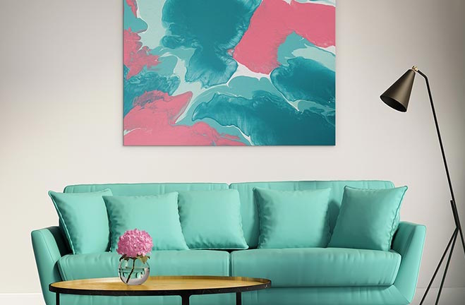
Turquoise
When your sofa is turquoise, you know you can have as much fun with artwork as you like. How subtle is that pink vase in the interior below? How perfect is the matching abstract? Thank you turquoise. We love you.
To contrast, watch how the hue in the pink of the vase of flowers is cleverly transitioned to purple. The decor is dominantly turquoise, but that piece of pink and the black lamp create harmony with the dramatic artwork.
Match

Clash
