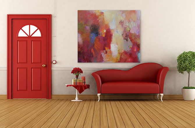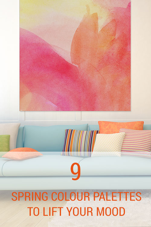
If you’re feeling a bit cooped up after a long Winter of home hibernation being passively entertained by technology (think TV and Internet), then our Spring colour palettes will draw you gently back into the light.
There’s no need to be scared off by Summer. Spring 2015 colours will hold your hand, carefully guiding you into the outdoors. They’re cool, soft, eclectic and ethereal.
Pantone Color Institute Executive Director Leatrice Eiseman introduces us to ‘understated brights, pale pastels and nature-like neutrals’ that ‘draw from daydreams of simpler times.’
She says colours like aquamarine, scuba blue, strawberry ice, custard and marsala will help us ‘disconnect from technology and unwind, giving ourselves time to stop and be still.’
It’s not about shunning technology altogether, it’s about creating quiet zones where we reconnect with nature as a form of escape.
Our Spring 2015 art collection is designed to enhance your wellbeing at home. It’s time to shrug off the remains of Winter and lift your mood.
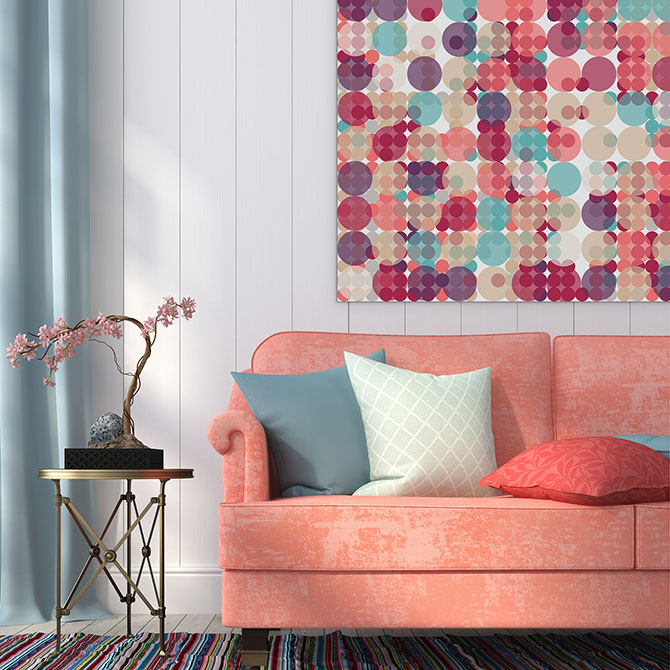
1. Cool hues with tangerine pops
From our Abstract Collection, this First Blooms Of Spring piece with its soft tangerine tones is an ideal match for cool strawberry, almond and aquamarine interiors. Energising and versatile, it’s sure to invite a smile.
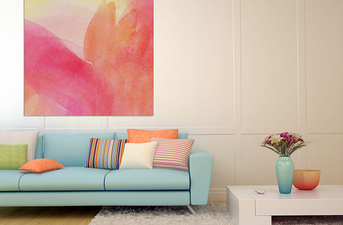
FUN-LOVING: We love the tangy edge this gorgeous Spring print gives this cool, crisp living space.
2. Bevelled glass with chestnut tones
Bevelled glass reminds me of sea glass, the colour of broken pieces of old fashioned Coca Cola bottles that have been tossed around by the ocean, creating smooth gem like stones. Like the seasons, the sea is always in motion and this is the colour of the glass we find washed ashore – a wonderful colour for Spring in preparation for Summer.
Complement this colour of treasure with a natural chestnut and you’ll create a cool, tranquil space where you can truly unwind.
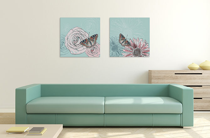
SOOTHING: This matching set ‘The Butterfly And The Flower’ uses the colour of bevelled glass to perfectly complement a cool Spring colour palette.
3. Glacier grey
The wonderful thing about the Spring 2015 colour palette is that it doesn’t cater solely for women. To negotiate this crazy world, men need to find peace and that peace may not necessarily come from strawberry ice. Glacier grey is the answer here.
Our Zen Art Collection is a wonderful place to find works that bring a sense of masculine strength and calm to life in the home.
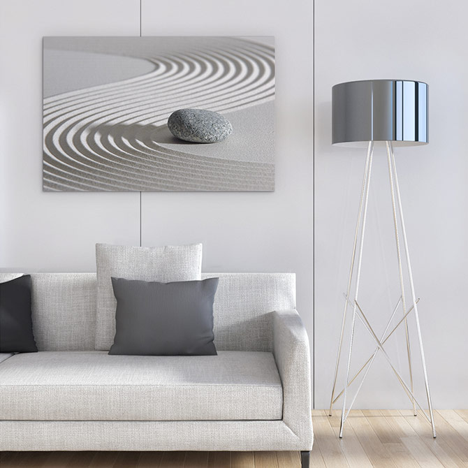
TIMELESS: To enhance peace at home, opt for something neutral. This glacier grey ‘Sand Swirls With Stone’ print from our Zen Collection is the answer.
4. Scuba blue meets classic blue
Spring 2015 fashion is all about the blues with aquamarine, scuba, classic and dusk blues dominating the charts. The broad blue colour spectrum provides something for everyone to enjoy.
Combine the playfulness of scuba blue with the reliability of classic blue to create a stunning interior that will inspire household harmony. This Abstract Blue Ocean Waves print, featuring touches of both tones, will serve as an anchor to many moments of fantasy.
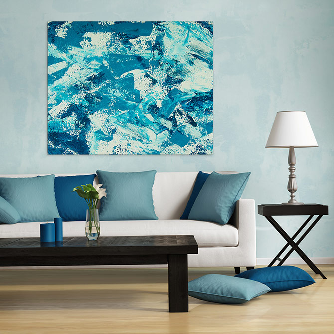
CAREFREE: Use scuba blue for excitement and classic blue to stay grounded.
5. Strawberry ice and aquamarine
Eiseman explains the Spring 2015 fashion palettes as a remembrance of simpler times, ‘retro delights, folkloric and floral art’.
Strawberry ice is the new pink, but a cooler candy version that excites the mind. Combined with the stress reducing aquamarine, we know that Spring has truly sprung.
REFRESHING: This Pastel Pops piece, combined with a gorgeous matching decor, is where the suggestive strawberry ice meets dreamy aquamarine to create a place of fun and wonder.
6. Minimalist tones with cues from nature
Who knew two neutral tones – glacier grey and toasted almond – could look so good together? Sometimes you never know until you try, but this time the colour experts have it bang on.
Inspired by nature’s warmth, this decor is ideal for lovers of minimalism as it suits both indoor and outdoor living areas – think family rooms, hallways, balconies and entertainment spaces.
ORGANIC SHADES: ‘Blowing In the Breeze’ art print brings a touch of nature into a contemporary, minimalist space.
7. Scuba blue with custard hints
From neutrals to brights, Spring 2015 has all tastes covered and it all starts with scuba blue. Combine this with a dash of delicious custard and you have a recipe for happiness.
When thinking of custard, think cheer, think comfort, think food. When thinking of scuba blue, think adventure – somewhere to play without a care in the world. Who doesn’t want that feeling in their own home?
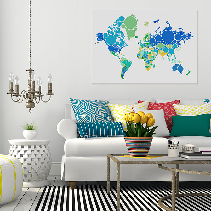
EXCITEMENT: Nothing inspires energy more than travel, making this ‘Dot World Map’ from our Maps Collection the ultimate in inspired wall art.
8. Aquamarine and periwinkle
We love keeping an eye on trends and we’ve decided periwinkle is Spring’s most exciting colour complement to aquamarine. How exciting does this bath, pot, wall art combination look against an aquamarine feature wall?
There’s no need to be completely bound by colour conventions. It’s OK to dip into what you love (e.g. aquamarine) and add your own passions.
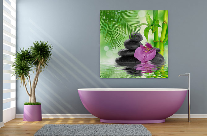
PASSIONATE: Periwinkle is the perfect panacea for ills and this print ‘Escape’ is just what the colour doctor ordered.
9. Strawberry ice and toasted chestnut
Sounds tasty doesn’t it? If you’re a fan of neutral toasted chestnut or toasted almond tones, you can still enjoy the colours of Spring without compromising on class.
While our Floral Collection does include lots of brights, a quick browse highlights some wonderful strawberry ice hues that achieve a subtle charm.
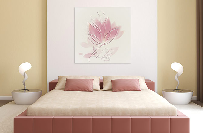
CHARMING: This ‘Dusky Pink Petals’ print adds a delicate, feminine touch to a classy neutral decor.
Colour your home beautiful and lift your spirits with a mixture of relaxing neutrals, calming pastels and cool, energising brights. Browse our Spring Collection now.