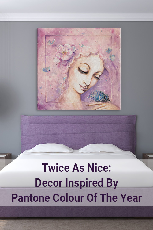
For the first time in history, Pantone has named the blending of two colour shades as Pantone Colour Of The Year 2016. The stunning ‘colour’ is a blend of Rose Quartz and Serenity.
Rose Quartz (or Pantone 13-1520) is a dusty pinky peachy colour. Serenity (or Pantone 15-3915) is a dusty light blue.
The team at Pantone have said that, joined together, Rose Quartz and Serenity ‘demonstrate an inherent balance between a warmer embracing rose tone and the cooler tranquil blue, reflecting connection and wellness as well as a soothing sense of order and peace.’
The idea is that these two welcoming shades are ideal for those who are looking for relief from the stresses of modern life. And isn’t that all of us?
To embrace serenity in your own space, let’s see how these calming blue and rose hues look together, on their own and when paired with other tones. 11 stress-free sanctuaries coming up!
Together At Last
Rose Quartz and Serenity is a fluid colour that mirrors a world shift towards gender equality. Not pink. Not blue. But pink and blue.
With that in mind, let’s take a look at how these colours can be used in a home, embracing the very best of femininity and masculinity.
1. Vintage charm
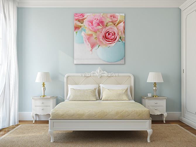
TWICE AS PRETTY: This ‘Pink Roses In A Vase’ print featuring the Pantone Colour Of The Year elegantly transforms an otherwise neutral room into a place of peace and calm.
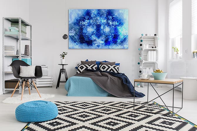
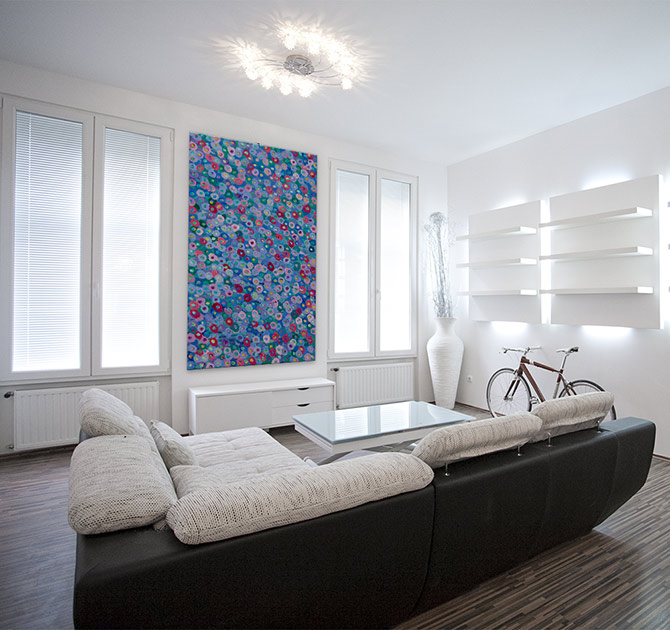
2. Psychedelic sky
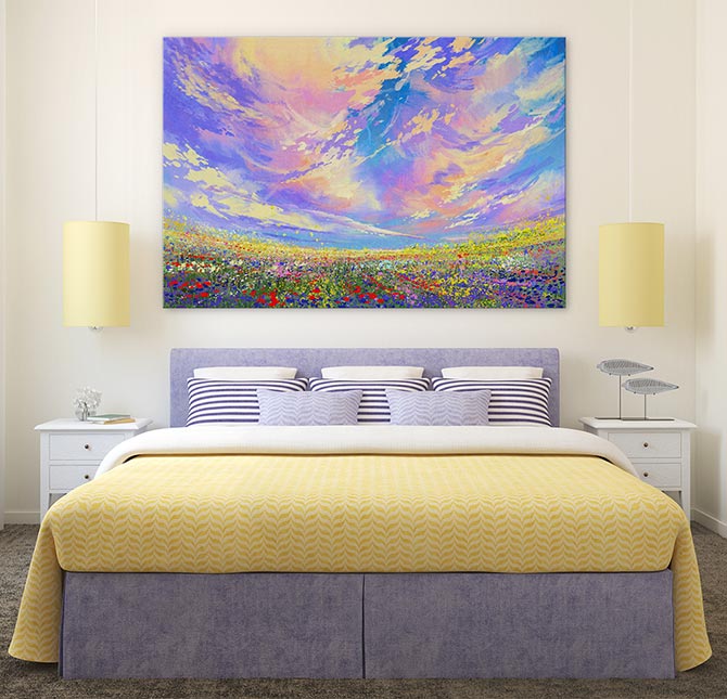
SOMETHING SPECIAL: Rose Quartz and Serenity dominates this ‘Summer Skies’ print, soothing an otherwise colourful interior decor.
3. Nature undisturbed
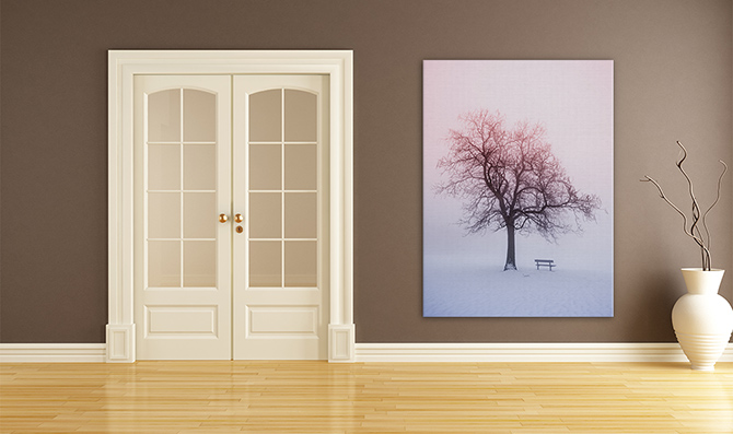
ALONE BUT NOT LOST: This ‘Winter Tree In Foggy Sunrise’ print shows how this gorgeous twin colour pair is also found in nature, encouraging us to embrace solitude.
4. Sunrise sails
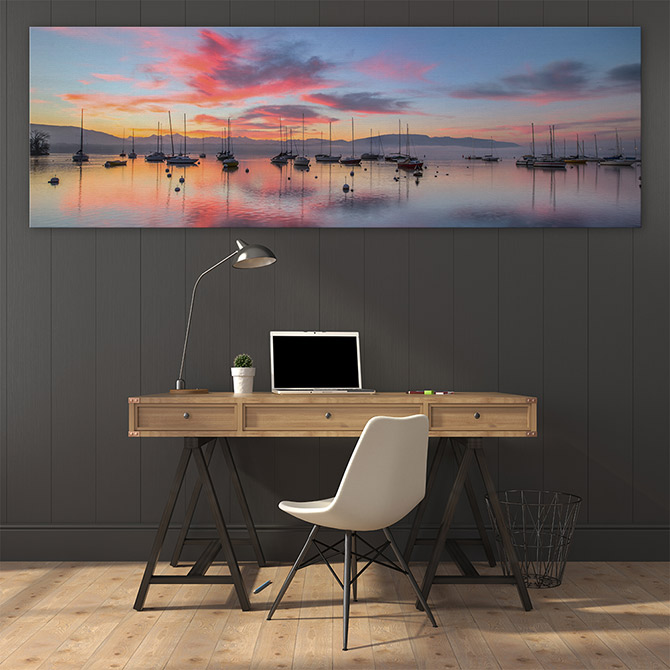
TRANQUILITY: This ‘Sunrise And Sailboats’ print provides a more masculine twist on the Pantone Colour Of The Year.
5. Nature’s silhouette
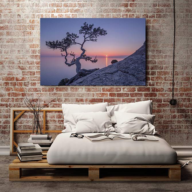
BE STRONG: This ‘Hanging On’ fine photography piece adds a spirit of strength to the sense of wellbeing offered up by Rose Quartz and Serenity.
Perfect Pairings
Our homes are already filled with colour, so how do we mix in the Pantone Colour Of The Year using our pre-existing brights and neutrals?
Here are some examples of how to create that safe space, protected from the weight of the world.
6. Enchanted butterflies
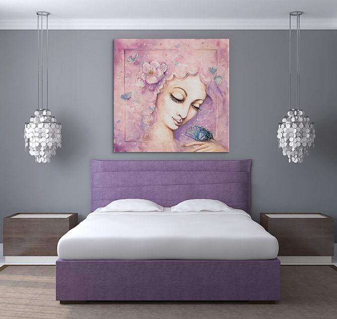
DREAM AWAY: A treasure for a young or teenage girl’s room, purple is the perfect complement to this splendid duo in ‘Butterfly Dreaming’.
7. Bird wonder
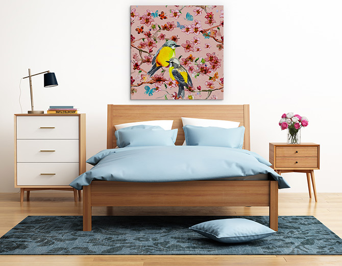
MIX IT UP: Embrace the 21st Century with this gender bender interior design, combining Rose Quartz and Serenity and this crowd-pleasing ‘Vintage Spring Birds’ print, wonderful for a guest bedroom.
8. Lively pastels
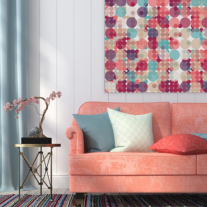
LET IT POP: This ‘Pastel Pops’ print gives the cool Colour Of The Year 2016 a whole new sense of fun, so don’t be shy when choosing an ‘It’ piece for your living area.
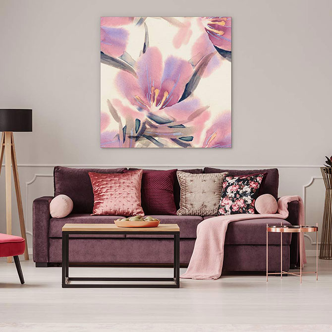
9. Cheeky nudes
DAPPLES OF COLOUR: This nude room is given new life with this ‘Peaceful Hues’ print which mixes Rose Quartz and Serenity in with a bit of zing!
Solo Effort
Don’t tell the people at Pantone, but we have secretly fallen in love with Rose Quartz and, if they were actually forced to choose just one colour, we reckon Rose Quartz would still have been perfect on its own.
To understand where we’re coming from, here are two beautiful interiors where Rose Quartz dominates the room and does very well on its own, thank you very much!
10. Eastern influence
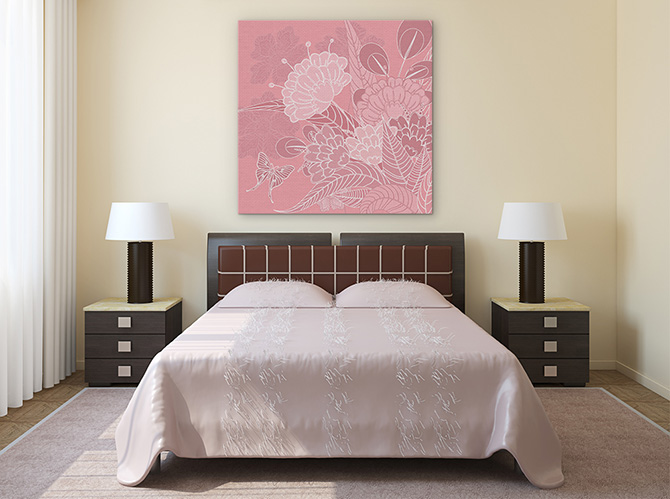
FEMININE WILES: Completely embrace the Rose Quartz by adding this ‘Blooming Pink’ oriental print to an already blooming pink interior decor.
11. Pretty patterns
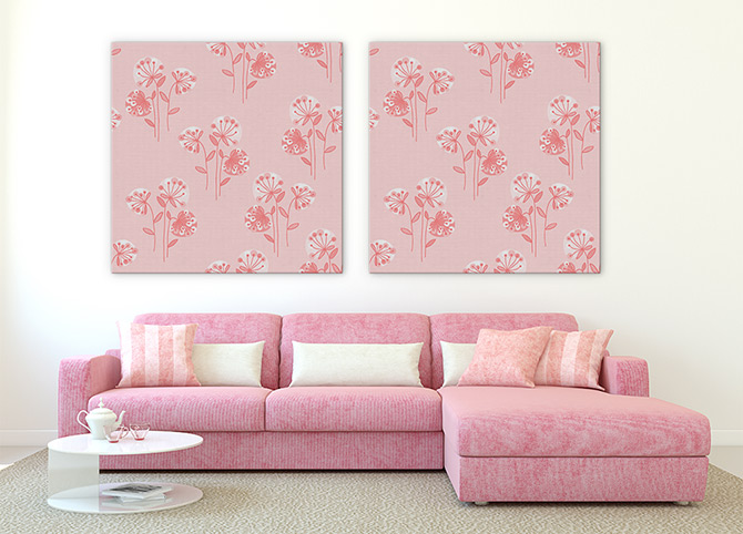
ROSE ON ROSE: Repeating this ‘Pretty Pink Flowers’ print in a pretty pink room is perfect for lovers of the Rose Quartz.